CASE STUDY
New Hope UCC
How we helped a progressive, LGBTQIA+ friendly church complete their merge with a
new brand, strategic marketing plan, and website built on belonging.
Strategic Partner: Paul Bourné
What Happened
Two Churches That Put Service at the Center
In Oak Lawn, Illinois, two congregations, Pilgrim Faith and Salem UCC, merged so they could better serve their community. Before they opened their doors, they wanted their name, look, and message to be as intentional as their mission.
Pilgrim Faith had spent years running a food pantry that reached about 2,300 people a year (or 45 families a week). Salem UCC had a tradition of handing out 50 to 60 handmade blankets to neighbors who were hospitalized, homebound, or in long-term care and live. They were also live-streaming Sunday worship on social media. Combined, the new congregation would offer dozens of programs: a low-cost counseling center, retreats, meals for people experiencing homelessness, and more.
They wanted people to understand what New Hope was about and make them feel comfortable before they walked through the doors.
Why They Called Us
As New Hope started this new chapter, they wanted to make the investment to ensure marketing was properly set up. They wanted their launch to reflect the depth of what they were building, so more people in Oak Lawn and Chicago's southwest suburbs would walk through their doors and stay.
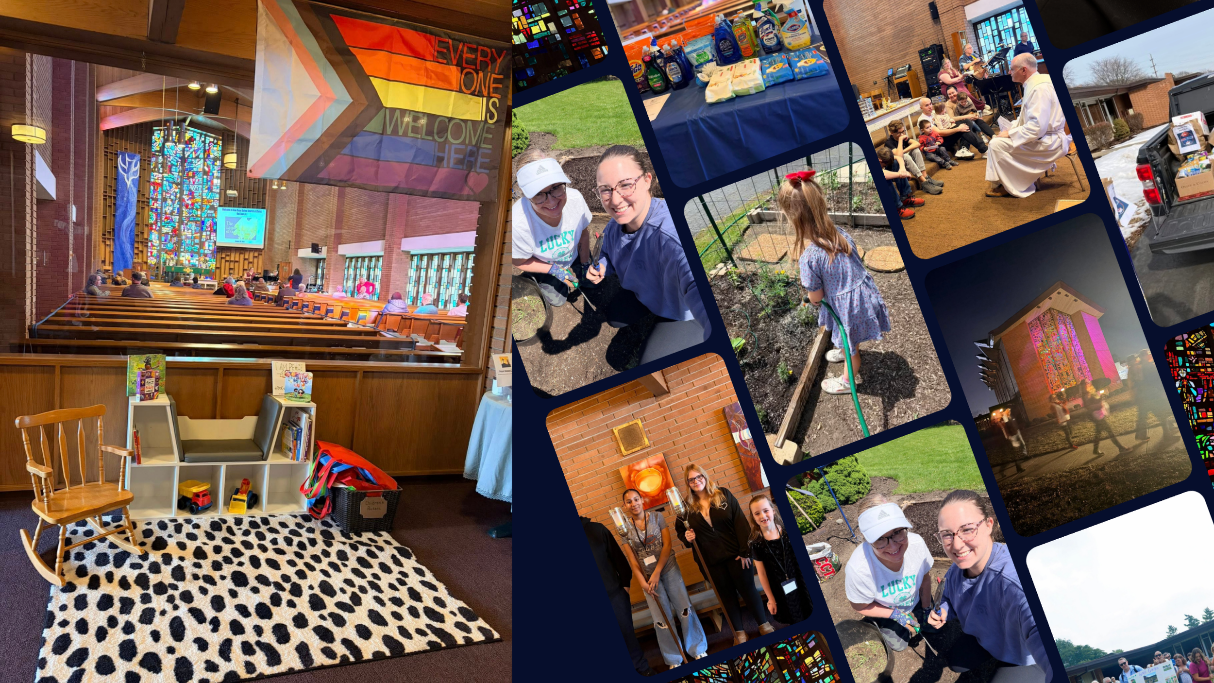
We brought in creative strategist Paul Bourné to lead visual identity, and we started by listening to people. We spent approximately 10 hours between asking questions and listening at a kickoff meeting with the marketing committee, one-on-one conversations with members and friends of New Hope, and attending several services. We also spent hours researching religous trends and Oak Lawn’s community culture.
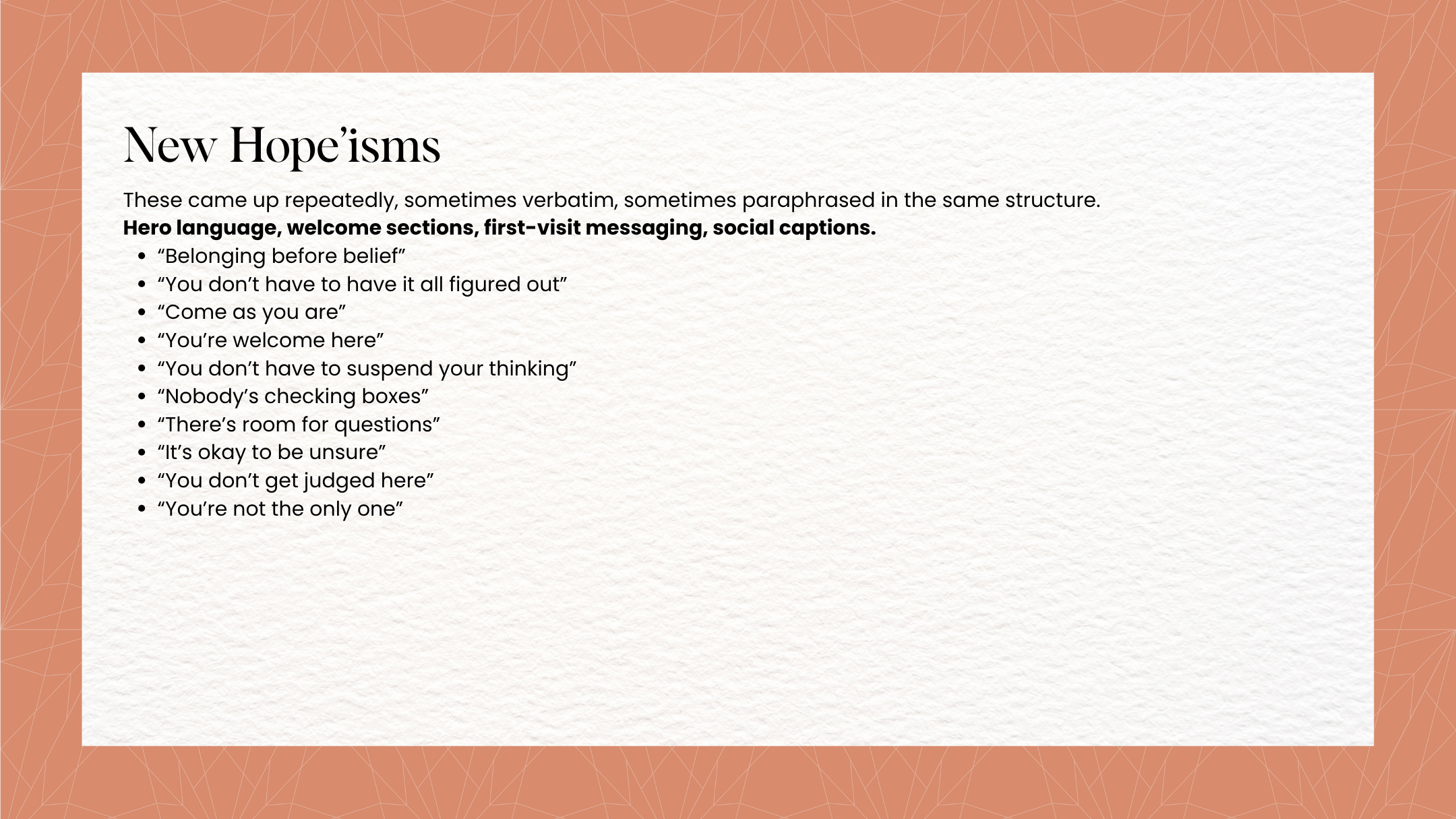
A theme surfaced almost immediately. At New Hope, you belong before you believe. Acceptance wasn’t something members say, it’s infused in New Hope’s culture. People are greeted by name, remembered week to week, met with a hug or a handshake regardless of who they are. Nobody has to check a theological box at the door.
A few other things stood out:
Theology is progressive, metaphor-driven, and intellectually honest.
Worship is modern, musical, rhythmic, accessible.
Members push back on performative evangelical theatrics and stiff, traditional "churchy" polish.
People want music that feels familiar, sermons that apply to a Tuesday afternoon as much as a Sunday morning, services under an hour, and a tone people kept describing the same way, hopeful, uplifting, energizing.
New Hope's physical space already felt peaceful and welcoming. The visual identity needed to match it, and invite people in before they'd read a single word.
We Listened First: Brand & Visual Identity
A Visual Identity United in Belonging
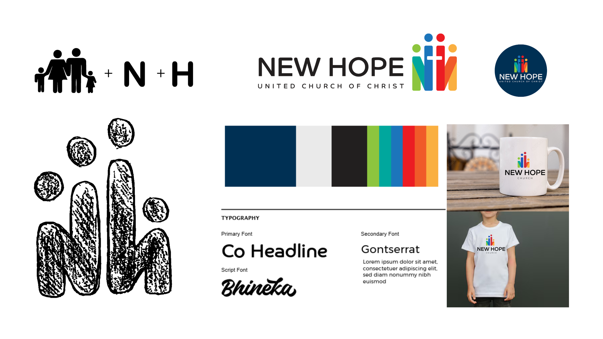
Paul developed several visual directions. The group chose one rooted in Ephesians 2:19: "Now, therefore, you are no longer strangers and foreigners, but fellow citizens with the saints and members of the household of God."
The final mark uses simplified, human iconography, a small family, arm in arm, to form an "N" and an "H." It's a lettermark and a symbol of community in one image, with a quiet nod to the LGBTQIA+ rainbow woven into the palette. Energy, connectivity, and approachability, built into a single logo.
From there, Paul built a full logo suite so the identity would hold up everywhere it needed to: the website, print materials, worship slides, video, and beyond.
A True Brand Has a Strategy & Voice
A brand is more than a color palette, so alongside the visual identity, we wrote New Hope a clear value proposition. Since this is a church, not a business chasing revenue targets, we also built a short set of questions staff and members could ask before saying yes to anything new:
Are we showing Christ's love?
Are lives being changed?
Will this help people feel like they belong?
Does this help us show up better for our neighbors?
Is this faith in action?
Are we lowering anxiety and raising connection?
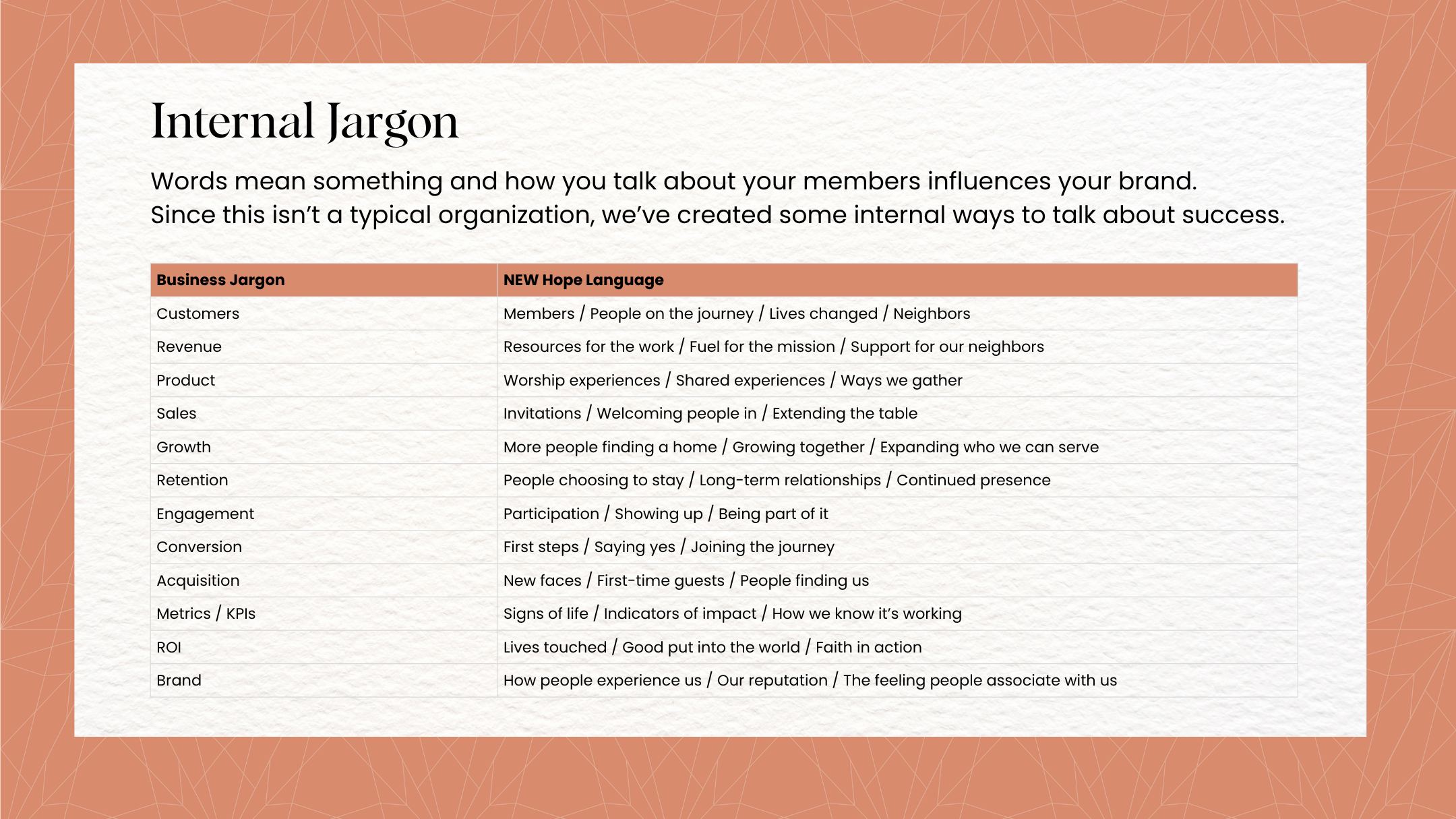
We also handed New Hope an internal vocabulary guide, so every program gets described in mission-driven language instead of bureaucratic church-speak, and full brand voice guidelines built from the actual words members used in our one-on-one conversations. If it came out of a real conversation with a real member, we made sure it had a place to live in the brand.
Building the Marketing Strategy & Website
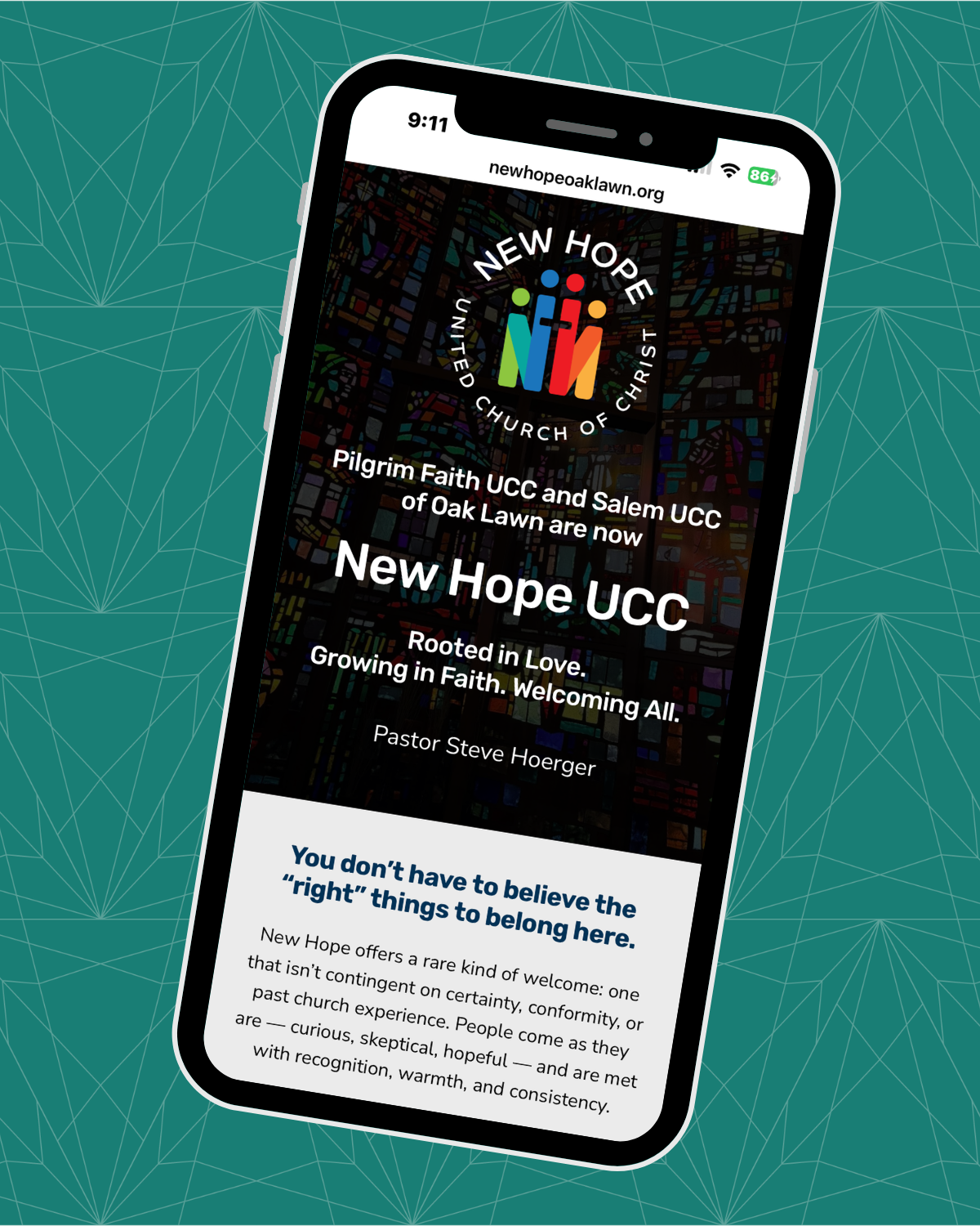
We also wrote a strategic marketing plan that focused on email and social media content marketing and getting out into the community to invite people to New Hope through casual, low pressure events and built a website with those ideas at the center.
Strategy Statement: In a lonely world where many people have been hurt by religion, New Hope exists to show Christ's love by being a place where everyone belongs, even if they don't believe yet.
New Hope does this by:
Showing Christ's love in action, not just in words
Helping people feel safe, seen, and like they belong, no matter who they are
Lowering anxiety and increasing connection
Showing up for neighbors across Chicago's South and Southwest Sides
Investing in changed lives, not just attendance numbers
Key action items:
Serve before you invite. Host a Community Resource Fair and pizza party as a first touchpoint, not a sales pitch.
Make it familiar. Weekly message videos from Pastor Steve or Pastor Dan, alongside the existing livestream, so people recognize a face before they ever walk in.
Be present beyond the building. Visible, ongoing participation in community life, not just Sunday mornings.
Practice unreasonable hospitality. A thoughtful, generous first-time experience for every new face at New Hope.
“…they went above and beyond our expectations. They are creative, organized and detail oriented. They completely understood our church, our message and the best way to present that to the community. We highly recommend them.”
— Pastor Steve Hoerger, New Hope UCC

Results

Since launch, Pastor Steve and the New Hope team have watched weekly Sunday worship attendance climb. A name change was never the goal. A place where more people feel like they belong, that was.
“…they went above and beyond our expectations. They are creative, organized and detail oriented. They completely understood our church, our message and the best way to present that to the community. We highly recommend them.”
— Pastor Steve Hoerger, New Hope UCC
FAQs About
New Hope UCC
-
A rebrand for a nonprofit goes deeper than a new logo. For New Hope Church, the work started with roughly 10 hours of listening which included a marketing committee kickoff meeting plus one-on-one conversations with members and friends of the congregation before any visual design began. From those conversations, we developed a full brand strategy including a value proposition, decision-making questions the staff and members could use to evaluate new initiatives, an internal vocabulary guide, and voice guidelines built from language members actually used. The visual identity, developed by creative strategist Paul Bourne, came after the strategy was clear — so the logo, color palette, and typography reflected who the congregation actually is rather than what a designer imagined a church should look like.
-
When two nonprofits merge, the branding challenge is holding onto what each community brought to the union while creating something that feels new not a compromise between the two. For New Hope, formed by the merger of Pilgrim Faith and Salem UCC in Oak Lawn, Illinois, that meant honoring the food pantry serving 2,300 people annually, the tradition of handmade blankets for homebound neighbors, and the theological identity both congregations shared, while building a visual and verbal identity flexible enough to represent everything the combined church would do next. The result was a lettermark that doubles as a symbol of community — a small group of people, arm in arm, forming an "N" and "H."
-
While churches need money to keep the doors open and the lights on, a church’s mission isn't about driving revenue. It’s primary goal is to serve people and make them feel like they belong before they walk through the doors. That shift changes almost every marketing decision. Instead of building funnels and conversion paths, you build welcome experiences. Instead of measuring cost per acquisition, you measure whether people feel safe, seen, and connected.
For New Hope, we built a short set of decision-making questions the staff could use to evaluate new initiatives including "will this help people feel like they belong" and "are we lowering anxiety and raising connection" so the marketing decisions stayed aligned with the mission. -
Authentic brand voice comes from listening to the people who already belong to your community, not from applying a template. For New Hope, we spent hours in one-on-one conversations with members and captured the exact words people used to describe their church. Members consistently described the tone the same way — hopeful, uplifting, energizing — and pushed back on both performative evangelical theatrics and stiff traditional churchy polish. That specificity shaped the entire voice guide. If it came out of a real conversation with a real member, it had a place in the brand.
-
Yes. While NEW Marketing Solutions specializes in performing arts marketing and audience development, the underlying methodology — deep listening, behavioral science-informed strategy, and building brands that create belonging rather than just visibility — applies to any mission-driven organization working on community, audience, or member engagement. New Hope Church in Oak Lawn is a recent example of that work in a non-arts context, and Nicole Wetzell partners with trusted creative collaborators like Paul Bourne when a project requires additional specialized expertise.